"Why do Drupal sites always have to look like Drupal", a friend of mine who works in brand development recently asked. "Any time I see a Drupal site, I know it right away". This really surprised me since my friend is usually pretty perceptive about these things, so I wanted to find out why he felt this way and hopefully to prove him wrong.
After looking over a number of sites, I think that what it comes down to is that MOST sites are very similar these days. Who doesn't have a header, menu, some main promotional blocks and maybe a stream of news on the front page? Its basically a "best practice" that everyone uses, which makes sites easier to use for first time visitors because they already know what to expect. Its not just Drupal that really looks alike these days, its every site that decides to use "standard layout", whether hand coded HTML, Drupal, Joomla, Plone, or whatever flavor of CMS happens to be used.
So I started to look around for sites that showed "out of the box" thinking. I wasn't looking for the best designed sites necessarily, but ones that showed that theming Drupal really is only limited by the creativity of the designers (and maybe budgets...).
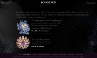
Boucheron, exclusive jewelry
 http://www.boucheron.com/
One of my favorite Drupal based sites belongs to the Gucci-owned jewelery brand Boucheron. This is a web gem that that is as beautiful as the jewelery they sell. Presented at DrupalCon Szeged by Cedric Perronnet , this site shows on many levels what can be done with Drupal. The full Flash based front end is simply amazing, but the back end integration into their stock management and sales system is worth noting also. Most pieces are one off designs and they have to be careful that inventory is properly managed not only online but also in their European and American shops.
Star Wars - the Old Republic
 http://www.swtor.com/info
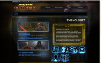
Proving that following standard layout styles can still look great, Lukas Arts and BioWare's new game Star Wars - the Old Republic is a Drupal site with flare. Starting with the large background image, this site uses large pictures throughout all the pages to help support immersion into the game's world. On all pages you'll find references to different aspects of the world which are explained in the Holonet. In this section of the site, the visitor really feels like he's interacting with a futuristic information system.
Francesca Battistelli, a singer's blog
 http://www.francescamusic.com/
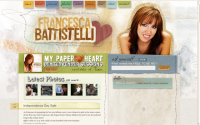
A little bit of theming can go a long way. On Francesca's site there is heavy use of hand drawn graphic features and texts which really give the site a strong visual style. As a developer, its pretty clear that this is actually a pretty typical site as far as site architecture goes, top menu, main banner, blog list - all the typical features are there. But because of the slick theme most visitors will consider this to be a unique and interesting site.
MIT Media Lab
 http://media.mit.edu/
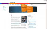
An incredibly clean, user friendly site, MIT Media Lab proves that less can be more. Starting with a very minimalistic page, visitors are surprised with playful animations, for example when going over the top menu or the soft curve of the main header image. These curved backgrounds strongly contrast with the otherwise linear, blockish layout and are also used to great effect all over the site.
Kerobia, an inspired single image site
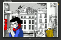 http://ontziak.kerobia.com/en/
Deserving special mention is the band Kerobia with a site that definitely breaks away from the simple grid style of presenting information. Almost flash-like, the site uses a single large main image creating a strong feeling for the site. Specific sections appear to be in a pop-up box but still have unique URLs so the site can be properly indexed. There are a few rough edges - sometimes clicking doesn't open or close a window, for example. Still, this is a great example of a Drupal site that doesn't "look like Drupal".
Drupal sites can be as creative as you can imagine
There are definitely a lot of possibilities with Drupal when it comes to theming. Many sites chose Drupal because they have to present a huge amount of information. There is a trade-off however for being extremely creative - your visitors will be able to more easily orient themselves on your site if it follows generally accepted layout rules. That said, I think you'll agree that these sites show that there is no reason at all to believe that a Drupal site can't also be a beautiful and creative site.
